Our new logo
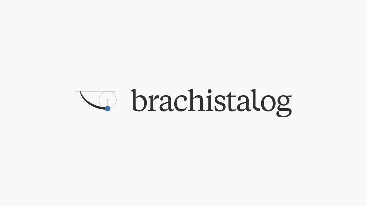
BrachistaLog has a new logo. It draws the curve our name comes from, and from today you will see it everywhere we are.
Why I changed it
The old wordmark was set in Kaneda Gothic. I made it in a hurry when I started the company, and over time it began to look dated to me. It also said very little about who we are.
I did like the old B mark, two cycloids stacked to make the letter. But a cycloid is not quite the curve our name refers to. So this time I changed everything at once.

The curve in our name
A brachistochrone is the curve of fastest descent. Let a ball roll from one point to a lower one, and it arrives sooner along this curve than along a straight line, even though the straight line is shorter. The name comes from Greek: brachistos, shortest, and chronos, time.
The curve is drawn by something simple. Roll a circle along a ceiling and follow one point on its rim. The path it traces is a cycloid, and from the ceiling down to its lowest point, that path is the brachistochrone.

What the logo shows
The mark is that construction, at the moment the curve is complete.
- The ceiling, the circle and its radius stay as faint lines, so you can see how the curve was made.
- The curve starts as a hairline and grows thicker as it falls. Its width follows the ball's speed.
- The ball, in our blue, rests where the curve ends.
The name is set in lowercase in Tiempos Text, a calm serif. The l of log drops straight down and lands along the same curve. Everything is in one colour; the only blue is the ball.
How it was made
BrachistaLog is a one-person company, and there is no budget for a design studio. I made this logo together with Claude Design, an AI design tool. It did not draw the logo on its own. I brought the idea, and we worked through more than thirty boards, from a plain curve with a dot to the final construction, until it said what I wanted it to say. I put everything I could into it.

Where you will see it
Everywhere. It is on this site from today, and it will replace the old logo in the app, our emails, packaging and everything else as each one is updated. As with the B mark, I plan to register the new mark as a trademark.